Insurify
Increasing sales by nearly 4% through a simpler car insurance shopping flow.
Duration:
6 months
Contribution:
Conducted research
Planned roadmap
Led and owned the redesign process
Established project's source of truth
Hosted online & in-person XFN workshops
Team:
1 Product designer (me)
1 Product manager
2 Product analysts
4 Engineers
1 Content designer
2 Sales
1 Insurance advisor
Brief:
OVERVIEW
Challenge:
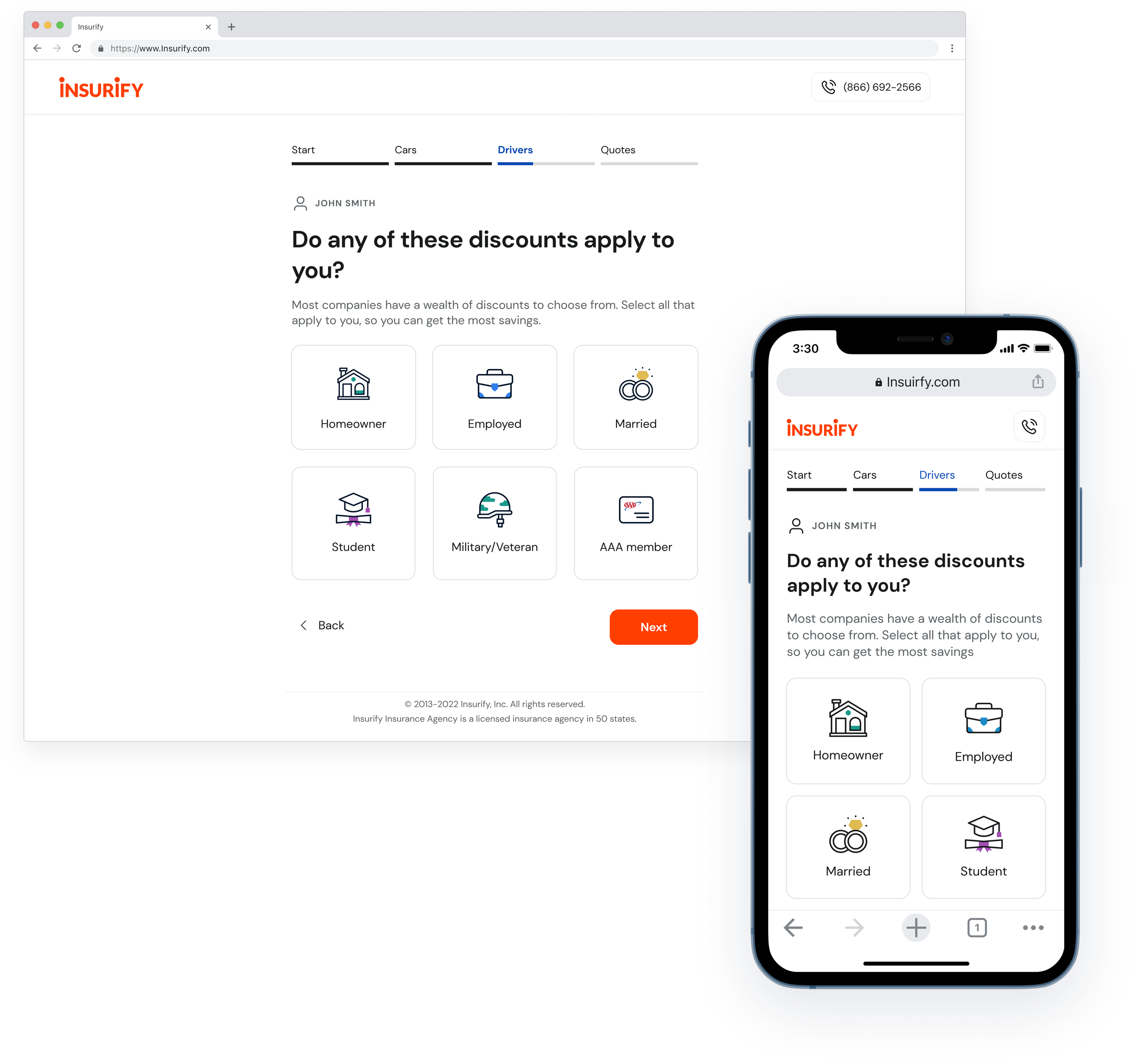
Unlike the traditional car insurance shopping experience, Insurify provides a more convenient way that lets users get insurance prices and compare all-in-one places. However, there is a significant drop-off in the question flow before customers reach the quote list page.
How might we assist users in completing the flow, ensuring they can obtain quotes, and increasing business conversion rates?
Solution:
Bring clarity and focus to insurance shoppers.
Prevent information overload by keeping the flow simple and clear, allowing users to receive quotes asap.
Serve personalized quotes with effortless editing.
New summary page enables users to review their answers and proceed to the quotelist with confidence.
Editing without unnecessary steps speeds up the flow.
20.37%
reduction in the drop-off rate for the car insurance question flow.
17.03%
reduction in the average time users spend on the question flow.
41.4%
improvement in customer satisfaction score.
Impact:
Overwhelming info, unclear terms and unnecessary steps
High-level:
Google Analytics: where are the drop-off points?
Interview the Sales team: What are users’ complaints?
In-depth:
User interviews: How’s users’ experience?
Screen recordings: How do users interact with the flow?
IDENTIFY PROBLEMS
Kickoff: What are the root causes of the massive drop-off rate?
Initially, I made some assumptions about the reasons for user dropoff through conducting a UX audit on the flow, but without adequate user insights from in-depth conversations. To resolve this issue, I collaborated with our product analysts, PM, and sales team to delve deeper into the root causes of the dropoff and determine if the product was meeting user needs.
Needs vs Challenges
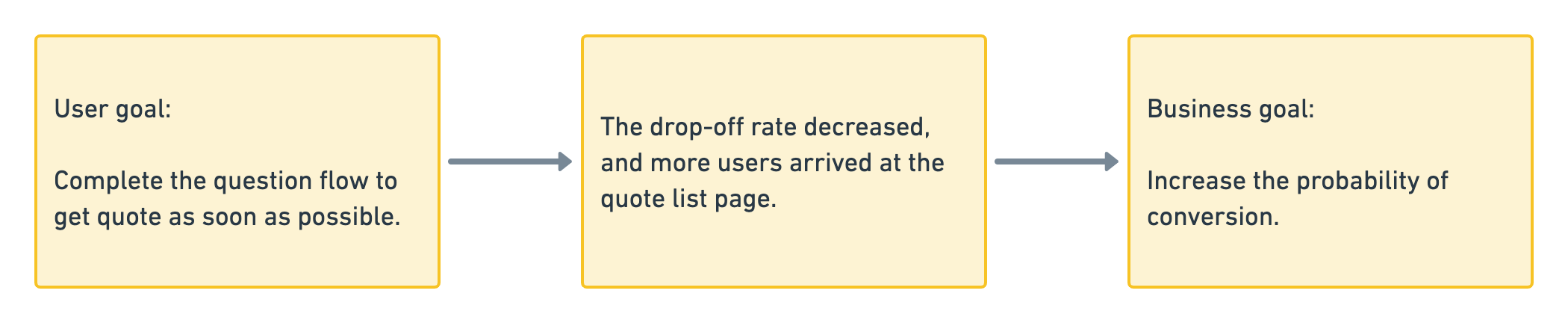
From user goal to business goal
Insurify aims to boost conversion rates, but we hinder this objective by challenges as illustrated above and not being able to assist users in reaching their goals as they want.
👇 That’s how we get on the right track.

"I'm wrapping up paying for my vehicle and need to get some insurance sorted out asap.
Closing to the payment (22%)
Need insurance to meet state requirements (16%)

#As soon as possible
#As simple as possible
Challenge: Information overload + Excessive questions
Having too many questions on a single page increases loading time and processing burden for users, who prefer #As soon as possible and #As simple as possible
#As clear as possible
Challenge: Unclear terms
In the past, we failed to provide adequate guidance to users who prefer #As clear as possible

#As accurate as possible
Challenge: Unneccessary steps in editing answers
Overloaded information and consuming terms made it easier for users to input wrong answers and lead to inaccurate quote. Excessive steps in editing made it even more challenging for users who prefer #As accurate as possible.
"I just wanna be able to quickly get the price on my phone without all the extra fuss."
Young generation (55%)
Mobile users (49%)
"I hope to get some quotes fast, but I'm feeling a bit unsure cause there's a lot of jumbled up lingo."
First-time buyers (51%)
ESL users (37%)
""I wanna double check quickly before I get to the quotes page so the quotes are spot-on."
Budget sensitive (76%)
Experienced buyer (49%)
Needs vs Challenge 1:
Needs vs Challenge 2:
Needs vs Challenge 3:
Explorations:
After fact-checking through various research approaches, it became apparent that there are several usability issues that make the user experience challenging. Additionally, I aim to design for user emotions such as urgency and create a scalable solution with a holistic approach.
How might we provide scalable and feasible solutions for users to obtain quotes easily?
HMW & SOLUTION1
-
Users may become impatient despite improvements in the user experience due to the lengthy flow. To address this, I propose providing estimated quotes based on essential questions discussed with insurance advisors. This will streamline the process and incentivize users to complete the remaining questions for personalized quotes.
Pros:
For users
Provide estimated quotes earlier.
Motivate users to complete the entire flow.
For team:
Gather essential user information and improve comprehension from must-have questions, even if the entire process is not completed.
Cons:
Require additional time for Engineering and Product teams to analyze the technological and developmental effort.
Click Chevron Down to see pros & cons
-
Pros:
For users
Reduce information overload.
Help users to focus on one question at a time.
Ease users’ cognitive load.
For team
Permits the product team to add or remove questions for testing.
Cons:
Failed to address the issue of too many questions.
Failed to consider user emotions and expectations management in design.
Click Chevron Down to see pros & cons
Solution:
After reviewing all the concept options, we chose to begin with concept 1 as the MVP, gradually scaling up to concept 2, and allowing buffer time for the Engineering and Product teams to assess the effort required.
Call back to the problem: information overload
Eliminate distracting and unhelpful elements from the get-quote flow based on feedback gathered during research.
Solve for #As soon as possible, #As simple as possible
Call back to the problem: unclear terms
The benefits of a single question flow include ample space to display instructions and explanations of terms, which can be shown above the fold, even on a mobile screen.
Solve for #As clear as possible, and extend to other users
Call back to the problem: for scalability and flexibility
Flexibility:
Single question flow provides more granular data for product teams to analyze, as well as the ability to conduct more targeted experiments for different user segments.
Scalability
To ensure scalability, I listed the design patterns we would use in the question flow, considering not only car insurance but also in other verticals.
How might we facilitate quick answer editing for users?
An interesting drop-off occurs right before the quote list page when users abandon the process. Interviews with users revealed that updating answers is a time-consuming and effort-intensive experience, leading to discomfort for cautious users who want to verify their information.
The sales team frequently hears complaints that users receive unexpected or high quotes for their car insurance due to incorrect answers they unconsciously inputted in the flow. While this finding may emerge after the insurance flow, it can prompt users to revisit the negative editing experience.
Call back to the problem: Unnecessary steps
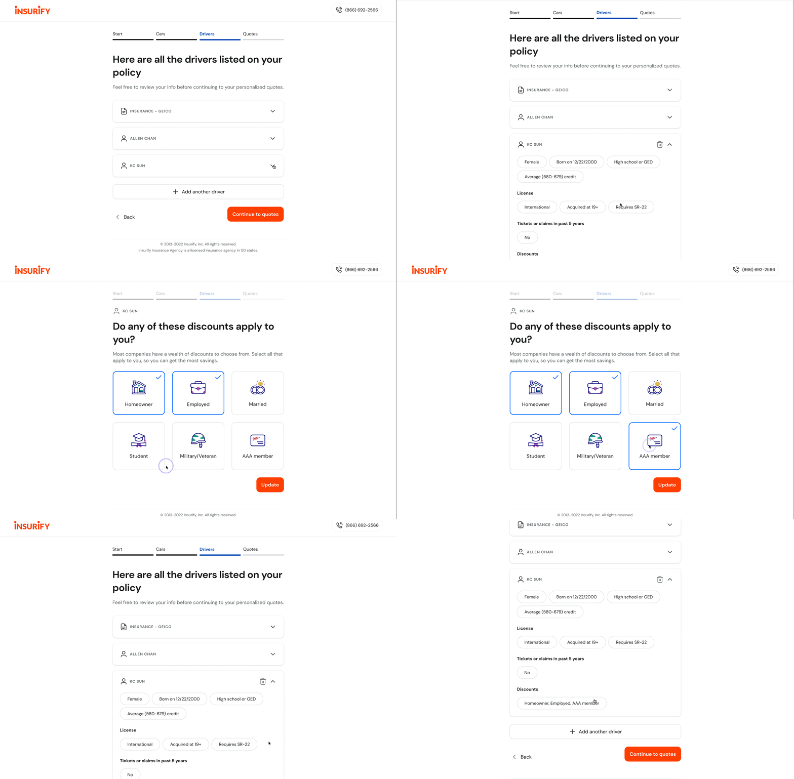
Include a summary page between each section and provide users with one-click access to editing mode from it.
Solve for #As accurate as possible
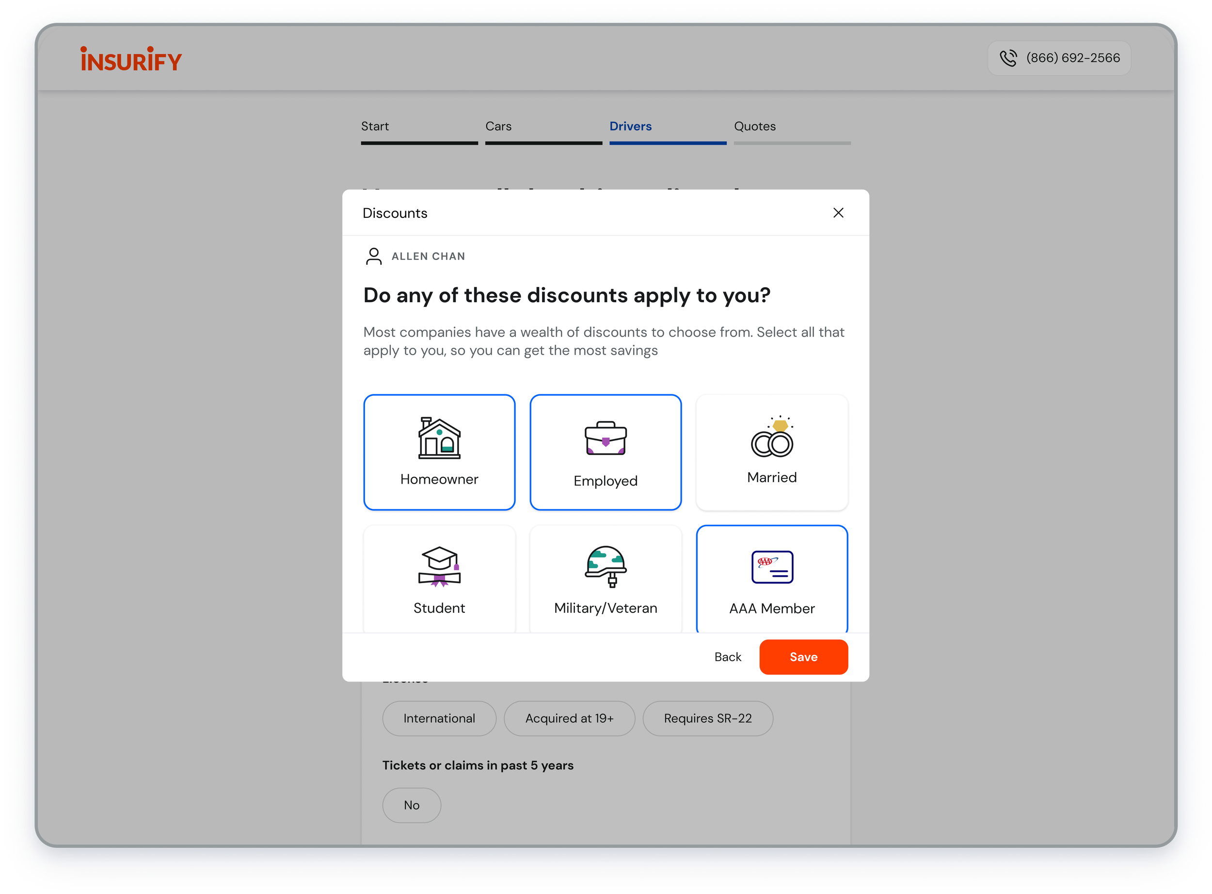
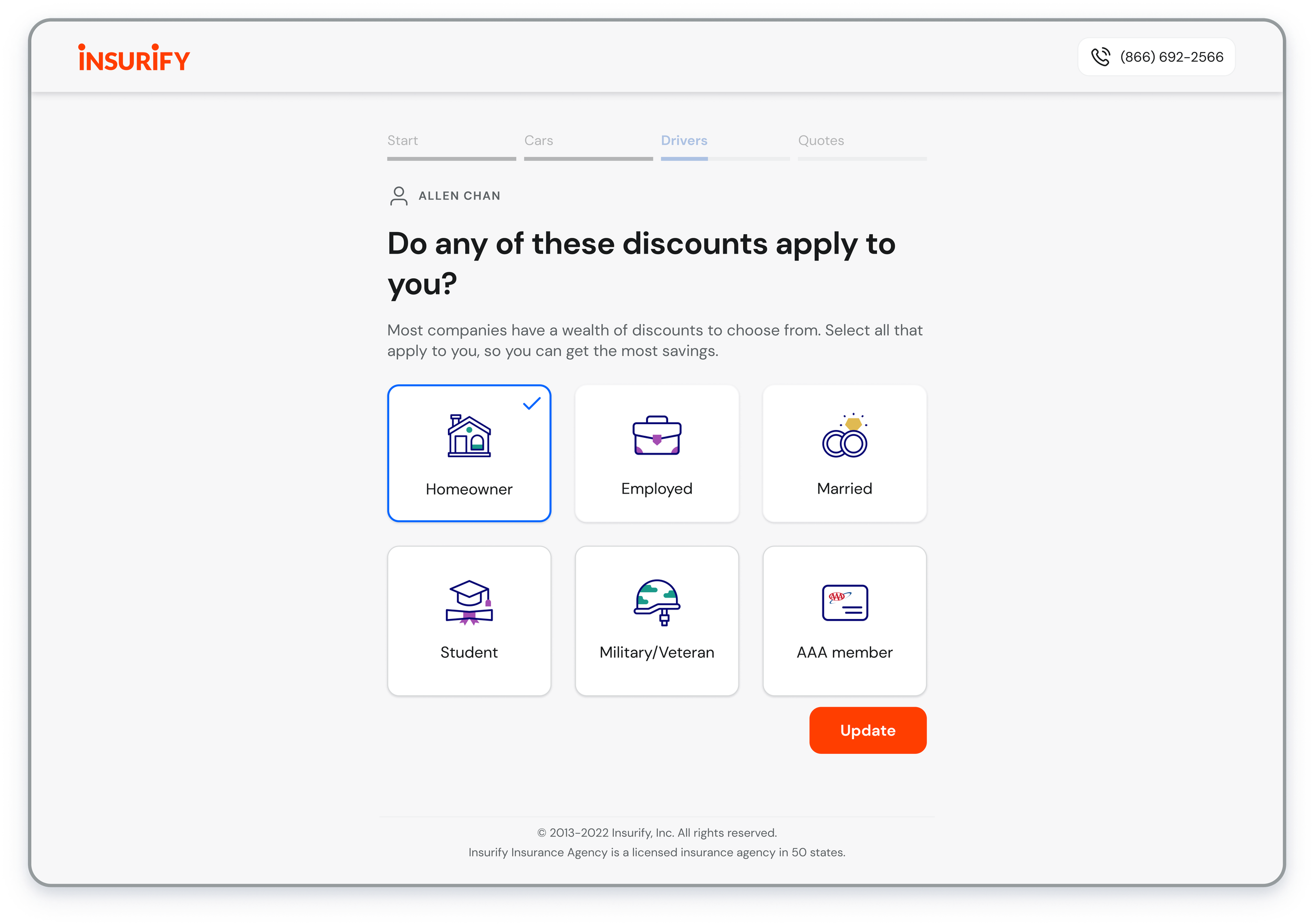
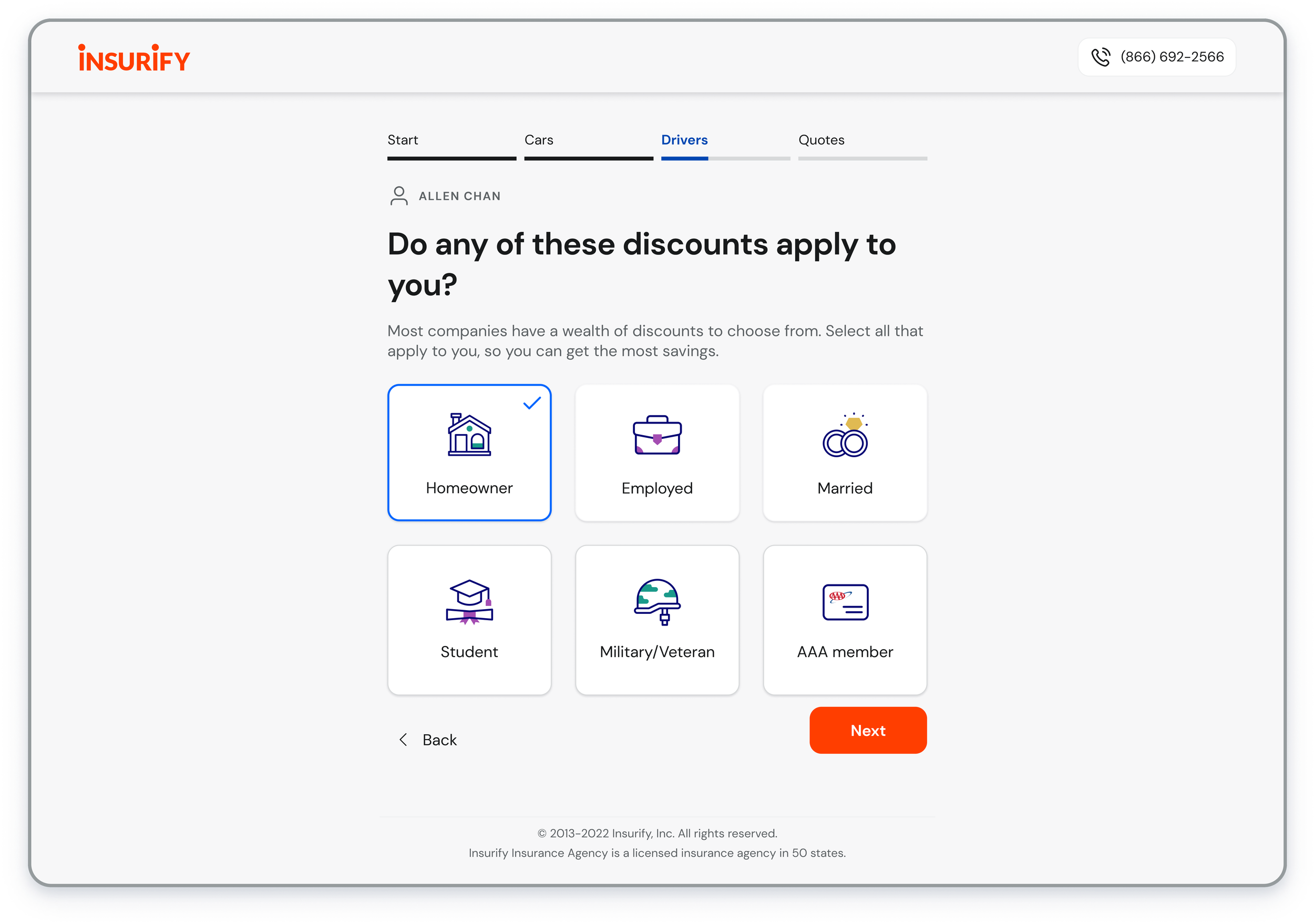
In addition to the summary page, it is crucial to consider how to display the editing mode after quick access. After multiple design explorations, we weighed the pros and cons of two options: editing in an overlay modal or editing on the original page.
Address issues for the temporary winner
Ultimately, we opted for "editing in modal." However, to avoid user wait time, we decided to implement "editing in original page" as our MVP. Additionally, I must devise solutions to address the issues related to this option.
Downgrade the visual promise of the stepper
Remove the ‘back’ button
Change copy in CTA from ‘Next’ to ‘Update’
HMW & SOLUTION 2
-
Pros:
Display changes promptly on the summary page.
Hide unnecessary affordance to help users move forward.
Ensure users can differentiate between editing and answering modes.
Cons:
More time and effort for the Dev team.
Click Chevron Down to see pros & cons
-
Pros:
Launch the product on time and reduce effort for the dev team.
Cons:
Users may struggle to distinguish between editing and answering modes.
Design for more edge cases
Click Chevron Down to see pros & cons
The new user experience allows users to quickly check and update their information to ensure accuracy and obtain quotes with confidence.
How might we alleviate the pain experienced by device-sharing users when using autofill during the question flow, while also extending its benefits to all users?
Autofill can fill out unmatched information, causing users to take longer to obtain a quote.
Autofill saves time by automatically filling in repetitive information like names, addresses, etc. However, autofill can provide incorrect information (image on left) and create a negative experience for device-sharing users. Despite being considered a marginalized group in underdeveloped countries, Insurify's user group has a 11% device-sharing rate, with autofill often filling out info from other shared users.
Providing a preview instills confidence.
Preview remains important for users to ensure that the information they provided matches their identity. To avoid long scrolling, we decided to only display essential identity verification information, such as birthday and incident records, after discussions with stakeholders.
Although the new design requires slightly more scrolling, the overall experience will be shorter as users arrive at the quote list page with confidence, reducing the likelihood of realizing incorrect answers and needing to update them later.
Solve for #As accurate as possible
INCLUSIVE DESIGN
Autofill results in mismatched information (left image), forcing users to correct it to match their identity (right image).

~4%↑
sale increase due to the drop-off rate reduced from 54% to 43%

Business Impact

1 min faster
Average time-on-task reduced from 5’55’’ to 4’52’’
41.4%↑
Customer satisfaction rate improved from 2.9/5 to 4.1/5
IMPACT
Lucid Nudging
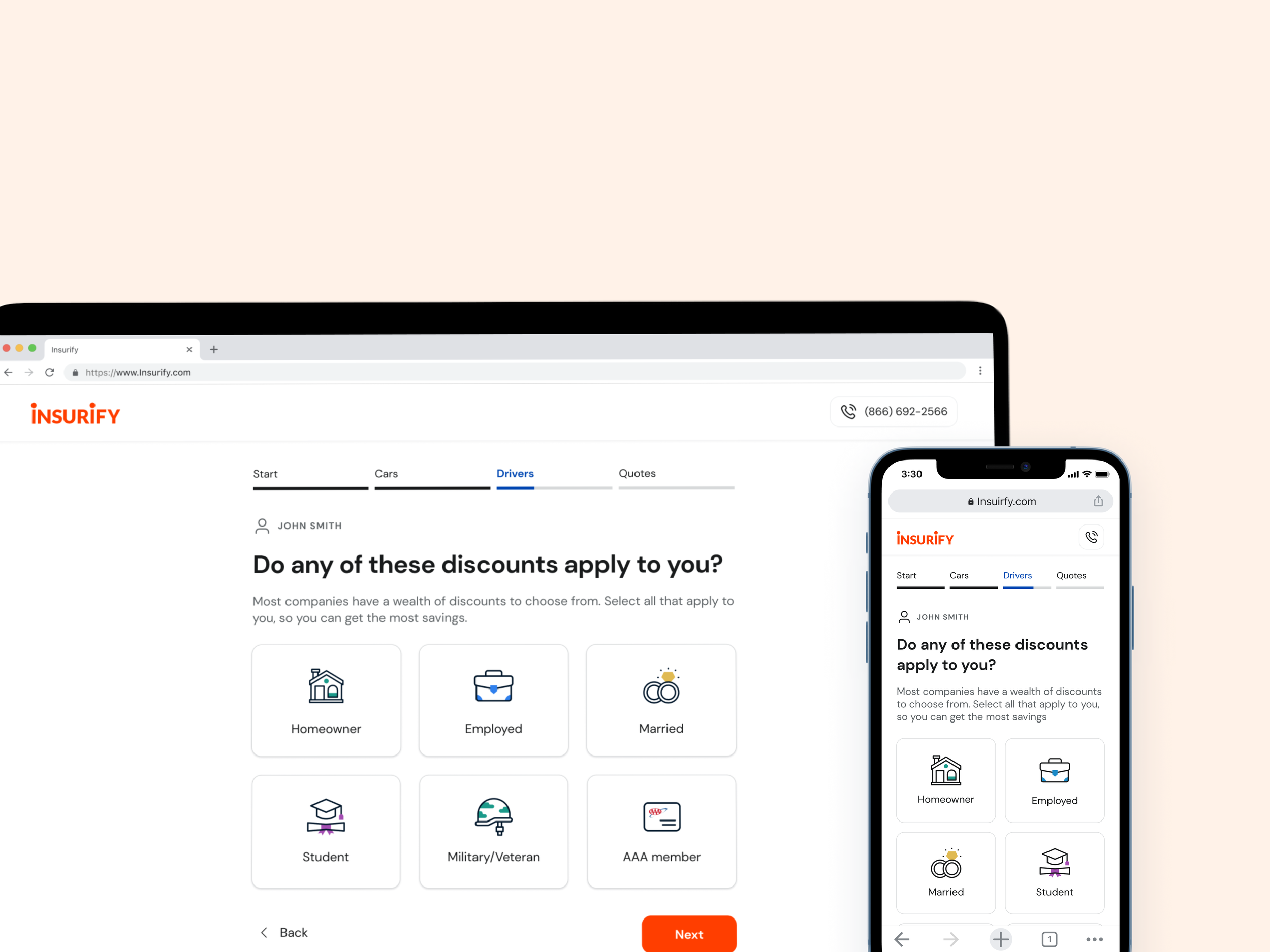
Insurify car insurance quote flow
Global Payment
Soca - Anonymous mode